2026-08-05-Note · Data 100: Visualization I(分布可视化)
课程:UC Berkeley Data 100(https://ds100.org/)
讲义:Visualization I - Data 100: Principles and Techniques of Data Science
0. 环境准备与数据读取
Cell 2:导入库并读取世界银行数据
import pandas as pd
import numpy as np
import warnings

warnings.filterwarnings("ignore", "use_inf_as_na") # Supresses distracting deprecation warnings

wb = pd.read_csv("data/world_bank.csv", index_col=0)
wb.head()
import warnings:导入 warnings 模块,用来屏蔽干扰性警告;warnings.filterwarnings("ignore", "use_inf_as_na"):忽略关于use_inf_as_na的弃用(deprecation)警告——pandas 未来版本会把inf当缺失值处理,这里先静音;wb = pd.read_csv("data/world_bank.csv", index_col=0):读取data/目录下的world_bank.csv,并把第 0 列(国家名)设为 DataFrame 的索引(index);wb.head():显示前 5 行,快速检查数据长什么样。
| Continent | Country | Primary completion rate: Male: 2015 | … |
|---|---|---|---|
| Africa | Algeria | 106.0 | … |
| Africa | Angola | NaN | … |
| Africa | Benin | 83.0 | … |
| Africa | Botswana | 98.0 | … |
| Africa | Burundi | 58.0 | … |
Continent 是分类变量(qualitative),GDP 增长率、人均国民收入等是定量变量(quantitative)——这决定了下文该画什么图。
1. 定性变量:柱状图(Bar Plot)的三种画法
Cell 4:pandas 自带绘图
wb['Continent'].value_counts().plot(kind='bar');wb['Continent']:取出Continent这一列(Series);.value_counts():统计每个大洲出现的次数,返回一个按频数降序排列的 Series;.plot(kind='bar'):调用 pandas 内置绘图,kind='bar'指定画柱状图;- 结尾分号
;:抑制 Jupyter 输出<Figure size ...>这类文本,只显示图。
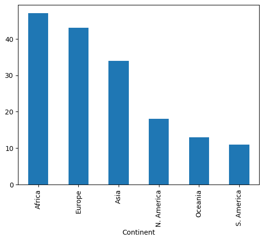
可以看到非洲的柱最高、南美洲最短。pandas 绘图虽然一行搞定,但功能有限,Data 100 不作为首选。
Cell 6:matplotlib 手写
import matplotlib.pyplot as plt # matplotlib is typically given the alias plt

continent = wb['Continent'].value_counts()
plt.bar(continent.index, continent)
plt.xlabel('Continent')
plt.ylabel('Count');
import matplotlib.pyplot as plt:导入 matplotlib 的 pyplot 接口,惯例别名plt;continent = wb['Continent'].value_counts():把频数 Series 存到变量continent;plt.bar(continent.index, continent):画柱状图——x 轴是类别(continent.index),y 轴是频数(continent);plt.xlabel('Continent')/plt.ylabel('Count'):手动加轴标签。matplotlib 不会自动标注坐标轴,必须自己写;- 分号同理,抑制多余文本输出。
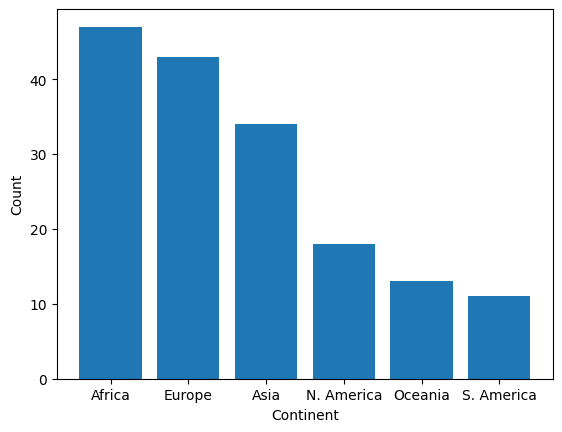
Cell 8:seaborn 一行搞定
import seaborn as sns # seaborn is typically given the alias sns
sns.countplot(data = wb, x = 'Continent', hue='Continent');
import seaborn as sns:导入 seaborn,别名sns;sns.countplot(data=wb, x='Continent'):直接传入整个 DataFrame 和要统计的列名,seaborn 自动计数并画图;hue='Continent':按大洲给柱子着色(这里颜色只起区分作用,不编码额外信息)。
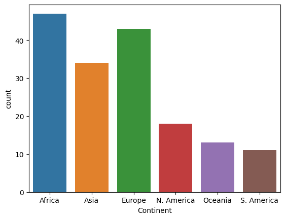
seaborn 底层就是 matplotlib,只是接口更简洁,会自动加轴标签和图例。
2. 定量变量不能画柱状图:overplotting
Cell 10:再看一眼数据
wb.head(5)wb.head(5):显示前 5 行。目的是思考:如果要把Gross national income per capita当”类别”,每个数值都会是一根柱。
Cell 12:硬用 countplot 的结果
sns.countplot(data = wb, x = 'Gross national income per capita, Atlas method: $: 2016');sns.countplot(data=wb, x='Gross national income per capita, Atlas method: $: 2016'):对定量变量的每一个唯一数值画一根柱,结果就是下面这张几乎无法解读的图。
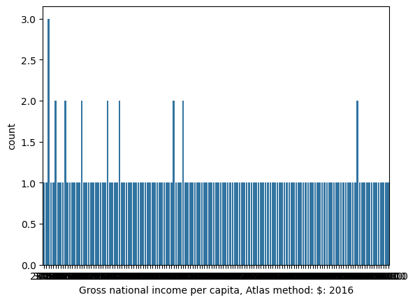
绝大多数柱高为 1(每个值只出现一次),看不出任何信息。结论:定量变量用 histogram / box plot / violin plot。
3. 直方图(Histogram)
Cell 14:matplotlib 版
gni = wb["Gross national income per capita, Atlas method: $: 2016"]
plt.hist(gni, density=True, edgecolor="white")

# Add labels
plt.xlabel("Gross national income per capita")
plt.ylabel("Density")
plt.title("Distribution of gross national income per capita");
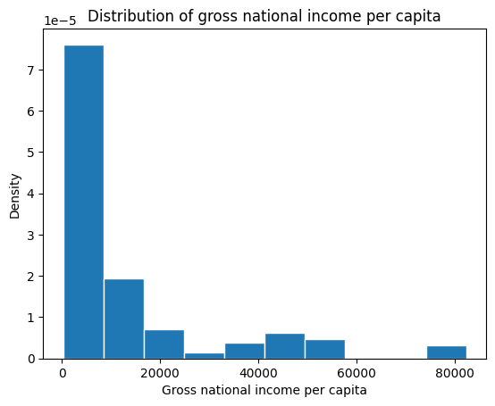
gni = wb["Gross national income per capita, Atlas method: $: 2016"]:把这一长名列取出存为gni(后面多次复用);plt.hist(gni, density=True, edgecolor="white"):画直方图。density=True是关键——让纵轴变成 density,每个 bin 的面积与数据比例成正比;edgecolor="white"给柱子描白边;plt.xlabel(...)/plt.ylabel("Density")/plt.title(...):轴标签和标题,都是手动加的。
Cell 15:seaborn 版
sns.histplot(data=wb, x="Gross national income per capita, Atlas method: $: 2016", stat="density")
plt.title("Distribution of gross national income per capita");
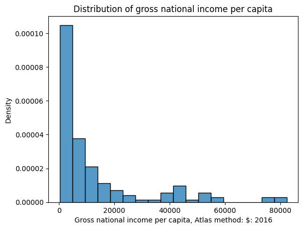
sns.histplot(data=wb, x="...", stat="density"):seaborn 直方图。stat="density"等价于上面的density=True,面积与比例成正比;plt.title(...):加标题(seaborn 不负责标题)。
4. 叠加直方图:用 hue 比较类别
Cell 17:先造一个新列 Hemisphere
# Create a new variable to store the hemisphere in which each country is located
north = ["Asia", "Europe", "N. America"]
south = ["Africa", "Oceania", "S. America"]
wb.loc[wb["Continent"].isin(north), "Hemisphere"] = "Northern"
wb.loc[wb["Continent"].isin(south), "Hemisphere"] = "Southern"
north = ["Asia", "Europe", "N. America"]:定义北半球大洲列表;south = ["Africa", "Oceania", "S. America"]:定义南半球大洲列表;wb.loc[wb["Continent"].isin(north), "Hemisphere"] = "Northern":wb["Continent"].isin(north)返回布尔 Series(该行大洲是否在北半球列表);wb.loc[布尔掩码, "Hemisphere"]选中满足条件的行的Hemisphere列;- 赋值
"Northern"即新建/填充该列;
- 最后一行同理,把南半球国家标为
"Southern"。
这个 cell 没有输出,只是为下一步准备数据。
Cell 18:hue 叠加
sns.histplot(data=wb, x="Gross national income per capita, Atlas method: $: 2016", hue="Hemisphere", stat="density")
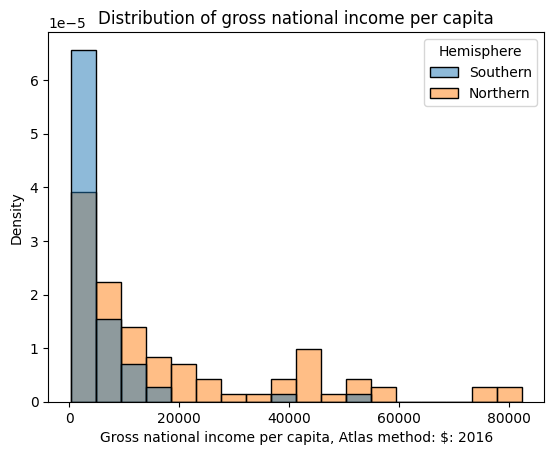
plt.title("Distribution of gross national income per capita");hue="Hemisphere":按半球分颜色,两张密度分布叠在一张图里,方便同 bin 比较;- seaborn 自动生成图例(legend)——只要颜色编码了信息,就必须有图例;
stat="density":仍然是密度,面积=比例。
5. 验证:“面积 = 比例”
Cell 20
densities, bins, _ = plt.hist(gni, density=True, edgecolor="white", bins=5)
plt.xlabel("Gross national income per capita")
plt.ylabel("Density")

print(f"First bin has width {bins[1]-bins[0]} and height {densities[0]}")
print(f"This corresponds to {bins[1]-bins[0]} * {densities[0]} = {(bins[1]-bins[0])*densities[0]*100}% of the data")
densities, bins, _ = plt.hist(gni, density=True, edgecolor="white", bins=5):plt.hist返回三个值——每个 bin 的密度数组densities、边界数组bins、画出的 patches(用_丢弃);bins=5表示分成 5 个箱;plt.xlabel(...)/plt.ylabel("Density"):轴标签;- 第一个
print:打印第一箱的宽度()和高度(密度 ); - 第二个
print:验证 宽 × 高 × 100 = ,即第一箱的面积恰好等于落在其中的数据百分比——这就是”直方图面积=比例,而不是高度”的实证。
运行输出:
First bin has width 16410.0 and height 4.7741589911386953e-05
This corresponds to 16410.0 * 4.7741589911386953e-05 = 78.343949044586% of the data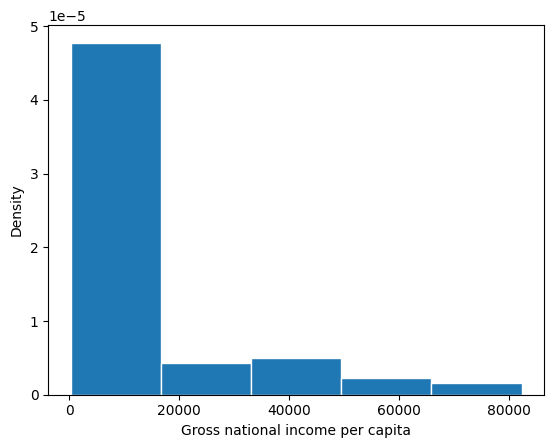
6. 解读直方图:偏度、峰数、离群值
Cell 22:右偏(positive skew)
sns.histplot(data = wb, x = 'Gross national income per capita, Atlas method: $: 2016', stat = 'density');
plt.title('Distribution with a long right tail');
sns.histplot(..., stat='density'):画 gni 的密度直方图;plt.title('Distribution with a long right tail'):标题提示这是长右尾分布。
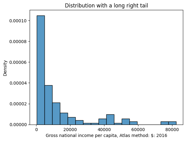
长尾在右 → 右偏 / 正偏,少数大的离群值把 mean 拉到 median 右边。
Cell 24:左偏(negative skew)
sns.histplot(data = wb, x = 'Access to an improved water source: % of population: 2015', stat = 'density');
plt.title('Distribution with a long left tail');- x 换成”改善水源覆盖率”列,其他参数与上面相同;标题提示长左尾。
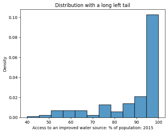
Cell 26 / 27 / 29:bins 数量影响峰数判断
# Cell 26:重命名长列名,5 个 bin
wb = wb.rename(columns={'Antiretroviral therapy coverage: % of people living with HIV: 2015':"HIV rate"})
sns.histplot(data=wb, x="HIV rate", stat="density", bins=5)
plt.title("5 histogram bins");
# Cell 27:10 个 bin
sns.histplot(data=wb, x="HIV rate", stat="density", bins=10)
plt.title("10 histogram bins");# Cell 29:20 个 bin
sns.histplot(data=wb, x ="HIV rate", stat="density", bins=20)
plt.title("20 histogram bins");wb.rename(columns={'...': "HIV rate"}):把超长列名改成HIV rate(返回新 DataFrame,必须重新赋值给wb);- 三个 cell 只改
bins参数:5、10、20。注意同一个分布,bin 数不同,看到的峰数不同——这是直方图解读中必须警惕的主观性。
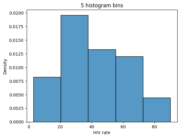
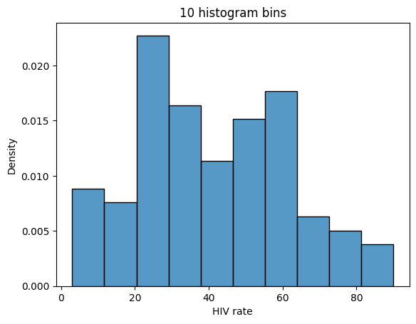
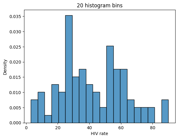
5 bins 看起来单峰(unimodal),10 bins 双峰(bimodal),20 bins 已经很难说哪里算峰。这种模糊性正是后面引入 KDE 的动机之一。
Cell 31:四分位数与中间 50%
gdp = wb['Gross domestic product: % growth : 2016']
gdp = gdp[~gdp.isna()]

q1, q2, q3 = np.percentile(gdp, [25, 50, 75])

wb_quartiles = wb.copy()
wb_quartiles['category'] = None
wb_quartiles.loc[(wb_quartiles['Gross domestic product: % growth : 2016'] < q1) | (wb_quartiles['Gross domestic product: % growth : 2016'] > q3), 'category'] = 'Outside of the middle 50%'
wb_quartiles.loc[(wb_quartiles['Gross domestic product: % growth : 2016'] > q1) & (wb_quartiles['Gross domestic product: % growth : 2016'] < q3), 'category'] = 'In the middle 50%'

sns.histplot(wb_quartiles, x="Gross domestic product: % growth : 2016", hue="category")
sns.rugplot([q1, q2, q3], c="firebrick", lw=6, height=0.1);
gdp = wb['Gross domestic product: % growth : 2016']:取 GDP 增长率列;gdp = gdp[~gdp.isna()]:gdp.isna()得到缺失值掩码,~取反后筛掉 NaN;q1, q2, q3 = np.percentile(gdp, [25, 50, 75]):一次算出 25th / 50th(median)/ 75th 百分位数;wb_quartiles = wb.copy():先复制 DataFrame,避免修改原数据;wb_quartiles['category'] = None:新建category列并初始化为 None;- 第一行
loc[...] = 'Outside of the middle 50%':条件(gdp < q1) | (gdp > q3)(注意|是 or,必须加括号)——落在中间 50% 之外的行标上Outside...; - 第二行
loc[...] = 'In the middle 50%':条件(gdp > q1) & (gdp < q3)标中间 50%; sns.histplot(wb_quartiles, x=..., hue="category"):按”中间/外部”着色画直方图,直观看到中间 50% 的范围;sns.rugplot([q1, q2, q3], c="firebrick", lw=6, height=0.1):在 Q1/Q2/Q3 位置画红色粗短线(rug plot),标出四分位数位置。
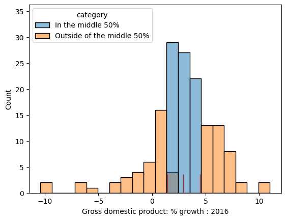
离群值定义: 或 (IQR = Q3 − Q1)。
后半部分(箱线图、小提琴图、KDE)见 2026-08-06-Note。